
Whenever I show someone something from my portfolio i usually get asked:
"how did you get in my house?", but more often "how did you do that?".
Take this illustration for a story about a boy that takes his friendly blue monster to school for Show and Tell day...

Like most pictures I draw, I pretty much have the image fully painted and finished in my head in a matter of seconds, it's the getting it onto the page that takes time.
I normally start with a very quick pencil sketch on very real paper , no more than a couple of minutes for roughing out the compostion and poses. I'll scan this in to my mac using some kind of wireless witchcraft and begin to draw each character and element in their own layer in Photoshop. I work at higher than standard resolutions (400-600dpi), it just gives me better results if i have to scale stuff up/down later.

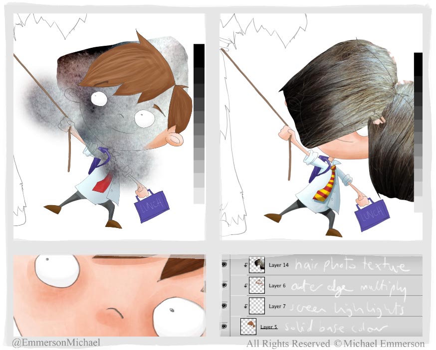
Then I usually work on each character and background as a separate file, I might block out large scale colours as a guide, frequently checking they all the bits are playing nicely together. For this boy i made a blocked out a base colour layer .
I then try to workout what his different 'colour sections' are (in this case hair, skin, shirt, trousers, lunchbox). On separate layers for each 'section' i build up simple gradients and shade, using custom photoshop brushes which behave a bit like acrylic paint (it's what i would use in the real world, but the computer screen gets very messy).
I start with big quick broad strokes, and work down to ever smaller and softer brushes for more detail and better colour blending.

When i feel i've done enough with brush work, i have a cup of tea and hope someone will have finished the picture for me when i return. This rarely happens.
So instead it's time to add another level of detail with a few select photo textures. I've got quite a big library of my own photos that i can delve into for all kinds of uses. Below, you can see how the raw texture looks, before i clip-mask it over the main block of colour. I've used a very high contrast montage of my skin (it doesn't look like that in real life) and my wife's hair (it does look like that in real life). I continue adding more layers of tone and brush marks until it feel just right.

That's one boy done, only all the rest to go. I work faster than a speeding bullet, so i usually can get a double page spread like this done in a day, from sketch to final.
So in conclusion to the original questions, a) I did it like I just said, only more complicated,
and b) I fell down the chimney.
No comments:
Post a Comment